What the concept explores
Give a specialty coffee range a confident presence across a family of tins.
 Brand & design studio
A shared voice. Two distinct varieties.
A specialty-coffee packaging concept built around confident typography and a clear colour distinction across a family of tins.
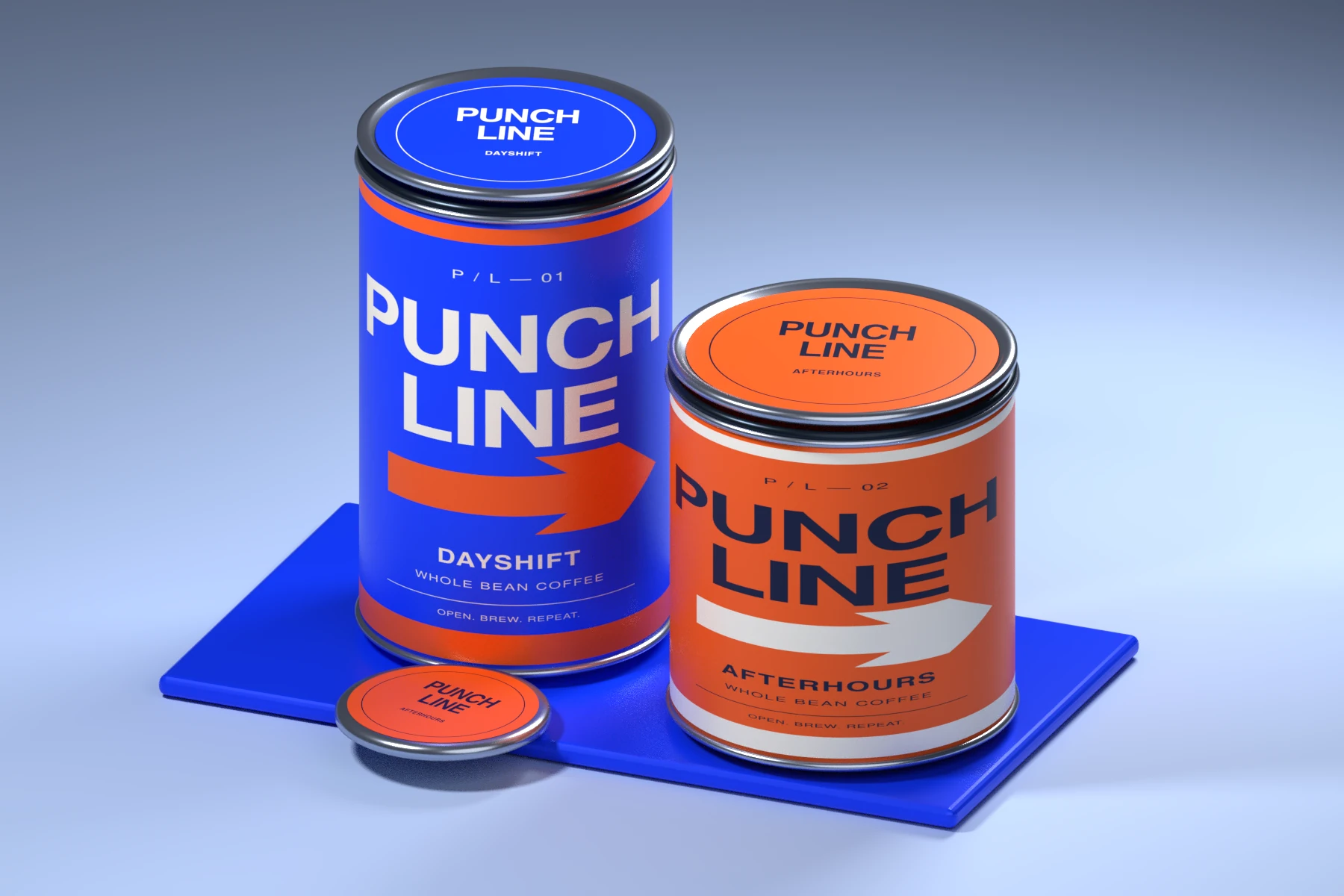
Give a specialty coffee range a confident presence across a family of tins.
Packaging direction, product-range design and label artwork studies.
Developed as a Vurrin studio concept.
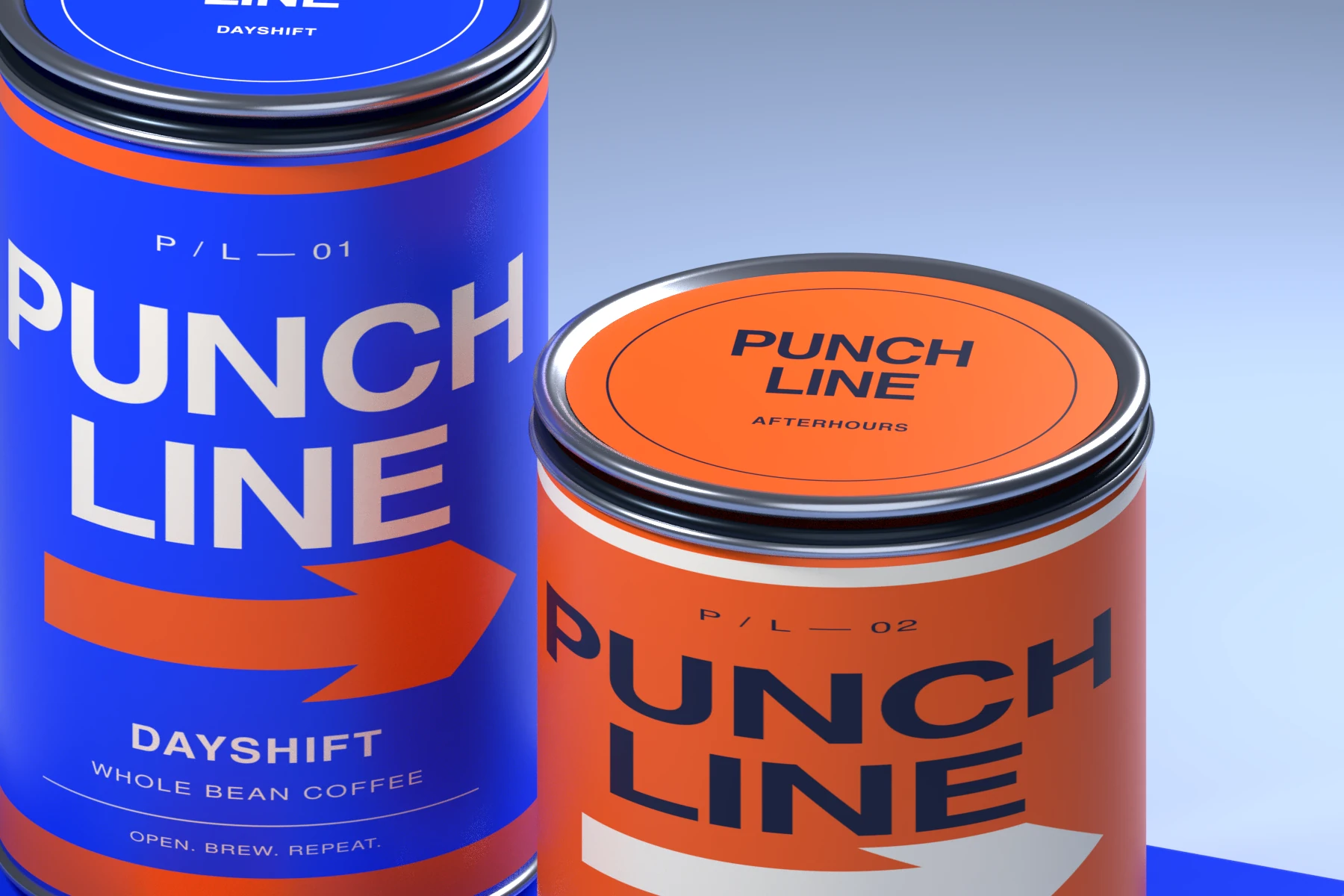
Oversized lettering gives the brand name a strong place on the tin and forms the main visual feature of the range.
Blue and orange separate the Dayshift and Afterhours varieties while retaining a connected composition.
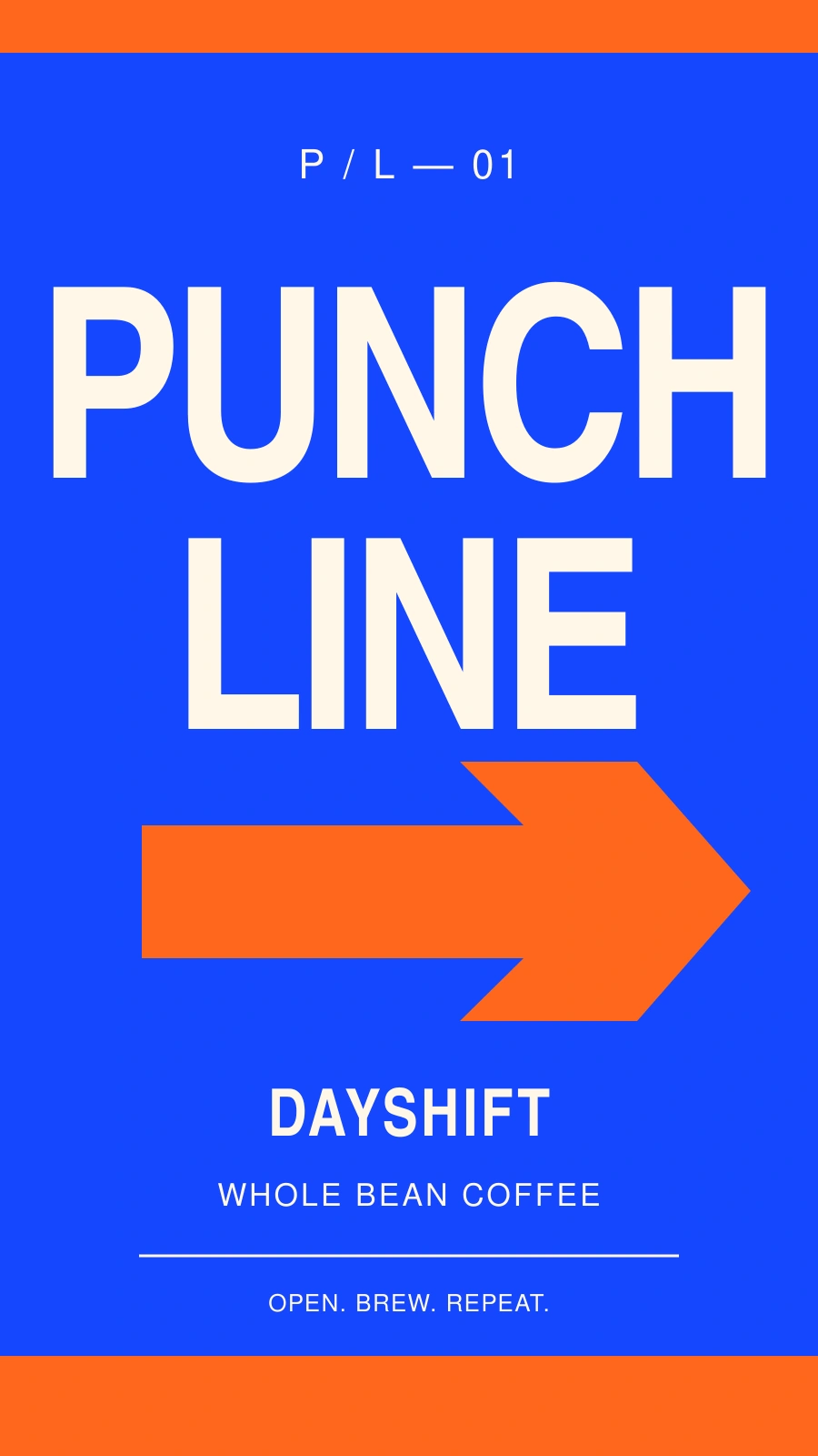
The flat label study makes the relationship between the typography, colour and supporting information visible beyond the product render.
A new brand, a fresh direction or a better website.